7 Graphics
The estimated amount of time to complete this chapter is 1-3 hours.
Standard plots (histograms etc.) are available with aminimum of effort from the user. It is possible to alter any aspect of the graph. Graphs in R are constructed using the ink-on-paper principle: You start with an electronic white sheet of paper on which you write graph elements (e.g. lines, axes). You can not remove an element once it has been added to the graph but instead you will have to start with a new sheet of paper.
In the first section of this chapter, you are introduced to basic graphics in R. The remaining sections illustrate how to modify your figures. In Section 7.3 you find a large training activity where you see how to obtain a specific figure by stepwise modification of your R commands. If you are short of time, you may postpone this activity.
7.1 Basic graphs
Most graphics functions support many optional arguments and parameters that allow us to customize our plots to get exactly what we want. In this chapter we will focus on how to modify point shapes and sizes, line types and widths, add points and lines to plots, add explanatory text and generate one plot containing several different plots.
7.1.1 Scatter plot
A scatter plot is a two-dimensional plot of the values of two quantitative (numerical) variables against each other. If X is an explanatory variable and Y an outcome variable, we will always plot the explanatory variable on the horizontal (X) axis and the outcome variable on the vertical (Y) axis. A scatter plot of y versus x may be produced using the plot() command in the form plot(x,y) or using formula notation plot(y~x) (the tilde ~ may be found using Option + ^¨-key on Mac, AltGr + ^¨-key followed by Space on Windows).
In the Sundby data named d (see Section 4) we may consider the association between height and weight:
plot( d$wgt ~ d$ht )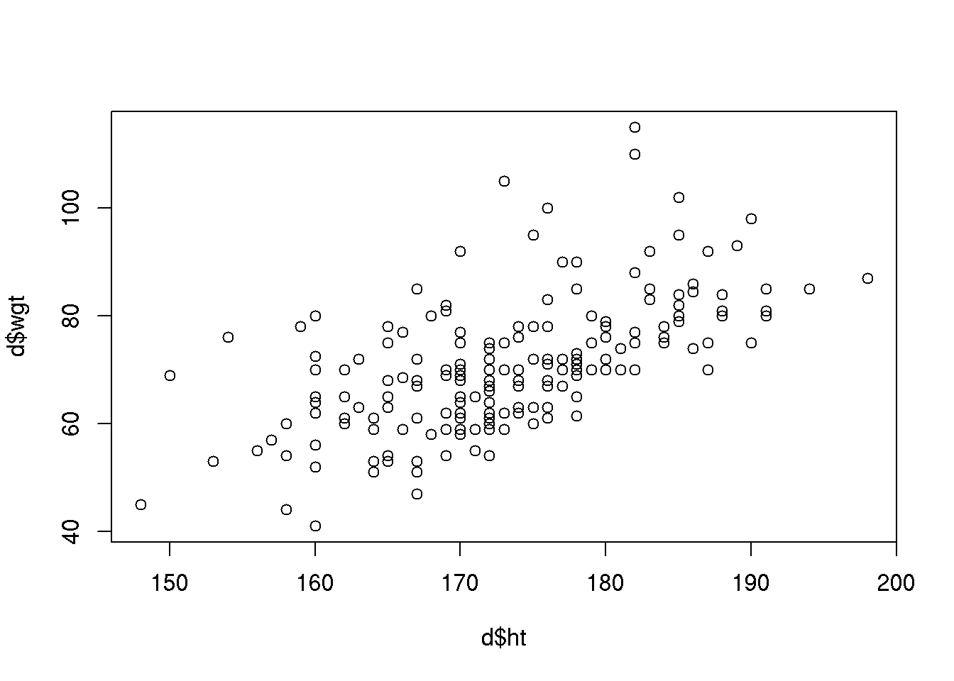
We can avoid using the $-notation by instead specifying the data set containing the variables to plot as an extra argument:
plot( wgt ~ ht, data=d )or similarly
plot( d$ht, d$wgt )Whether we use $-notation or not does not matter for the plot() command, but some plot commands (and some of the commands used for analysis you will learn during the course) will not accept both ways of specifying the x and y variable (an example is the histogram described below (Chapter 7.1.2)).
We may modify basically everything in the scatter plot. Some of the most common user adjustments are to control the range of the axis (x-limits xlimand y-limits ylim), the plot character (pch), the color (col) of the dots, the labels on the axes (xlab and ylab) and add a title (main):
plot( d$ht, d$wgt, pch=19, col='blue',
      xlim=c(140,210),ylim=c(0,140), xlab="Height", ylab="Weight", main="Sundby")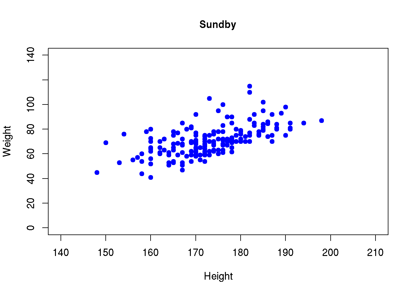
A list of arguments to the plot character argument pch is found in Chapter @ref{colors}, here we used the plot character code 19 that corresponds to a solid bullet.
We may also use different colors for males and females. This is specified using the col argument. The gender variable has codes 1 (males) and 2 (females). Colors may also be specified using numbers, code 1 is black and code 2 is red (more details about color codes are found in Chapter 7.4). If we specify the gender variable as the color, we will obtain black dots for males and red dots for females:
plot( wgt ~ ht, pch=19, col=gender, data=d,
      xlim=c(140,210),ylim=c(0,140), xlab="Height", ylab="Weight",
      main="Sundby")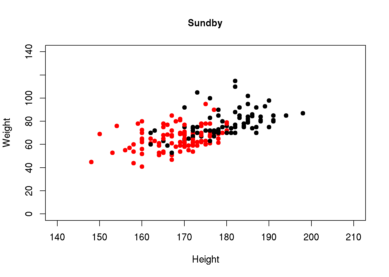
7.1.2 Histogram
A histogram is produced using the function hist():
hist( d$wgt )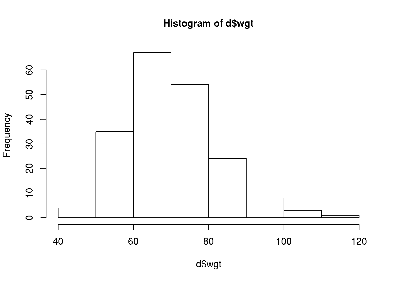
The histogram takes as first argument a numeric vector and further arguments may be used to customize the histogram. Some of the arguments to the various plot commands are identical, for example the col, xlab and main arguments.
For the histogram we may also specify the values defining the width of the bins using the argument breaks. If we want the width of the bins to be 5 we have to specify a vector of the form 40, 45, … 110, 115 with the lowest value being lower or equal to the lowest observed value and the largest value equal to or larger than the largest observed value of our weight variable. The range of the weight variable is found to be 40 to 115 (use range( d$wgt, na.rm=T ). A vector with elements from 40 to 115 with steps of size 5 may be defined using the sequence function seq():
seq( from=40, to=115, by=5 ) [1] 40 45 50 55 60 65 70 75 80 85 90 95 100 105 110 115The histogram may now be altered to:
hist( d$wgt, breaks=seq(40,115,5), col='lightblue',
      main="Sundby", xlab="Weight")
The histogram can only be produced using $-notation - hist( wgt, data=d ) does not work!
To add density curves to the histogram, see Chapter 7.5.1
7.1.3 Boxplot
A boxplot is used to illustrate key features of the distribution of a numerical variable for different subgroup, for example we may study the distribution of weight for each gender:
boxplot( wgt ~ gender, data=d )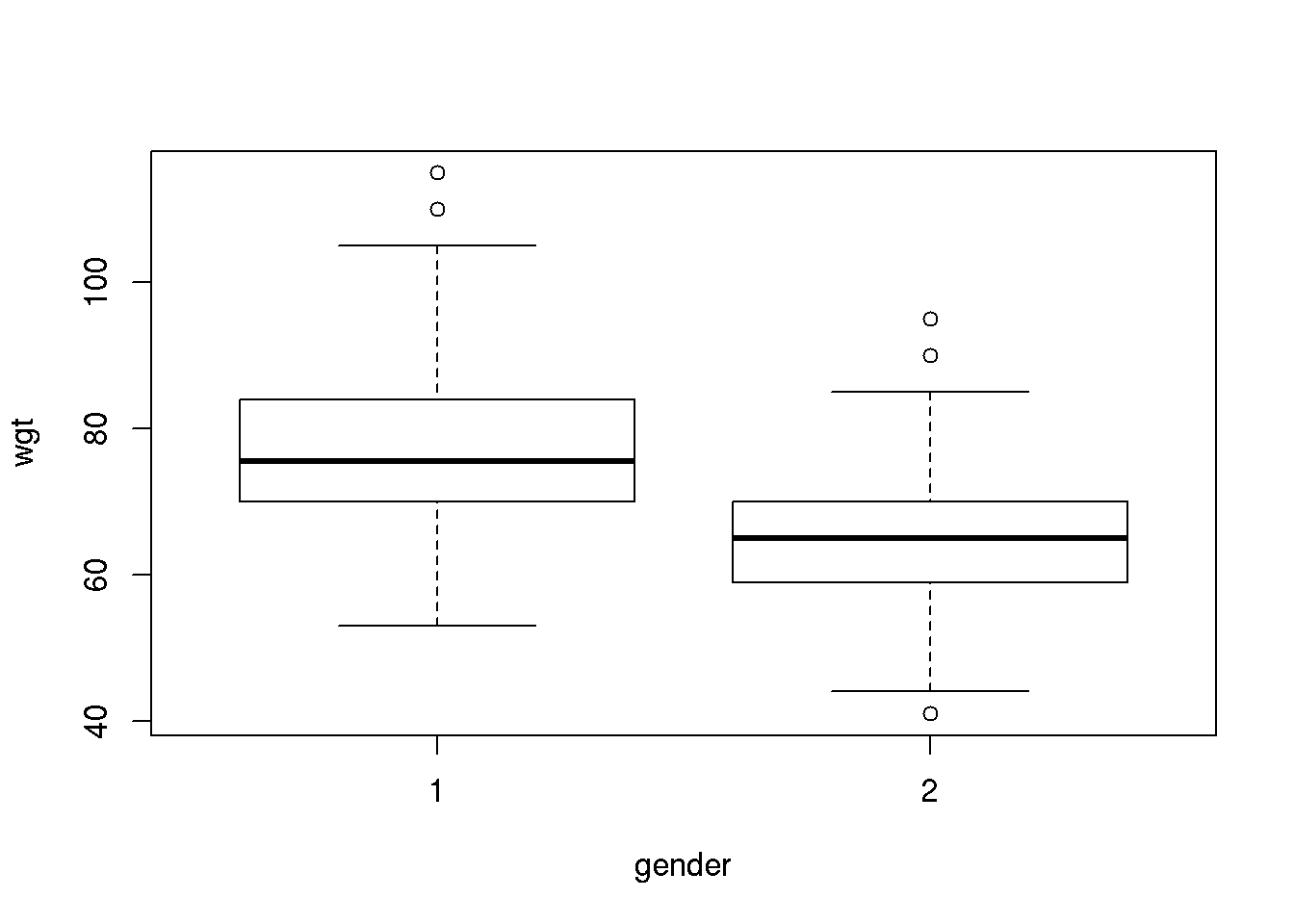
For each gender, the boxes display the inter quartiles, i.e. the 25’th and 75’th percentile (often referred to as Q1 and Q3 for the first and third quartile). The center 50% of the data points are thus within the box defined by the inter quartiles. The length of the whiskers is 1.5 IQR (Inter Quartile Range = Q3-Q1) however not longer than corresponding to the smallest / largest observations. If data are normally distributed 99.3% of the data points should be within the range of the whiskers.
The boxplot may also be customized:
boxplot( wgt ~ gender, data=d, main='Boxplot of weight', xlab='Weight',
         names=c('Males','Females'), col='lightgray')
7.1.4 Stripchart
The stripchart is an alternative to boxplots when the sample size is not large. The stripchart illustrates the individual data points as a function of a categorical explanatory variable (here gender):
stripchart( wgt ~ gender, data=d )
Typically we will adjust the plot to have the explanatory variable (gender) on the x-axis, add noise in the x-direction to separate points, add a title and further add labels for the gender-varible on the x-axis:
stripchart( wgt ~ gender, data=d, vertical=TRUE, method='jitter', pch=19, main='123',
            group.names=c('Males','Females'))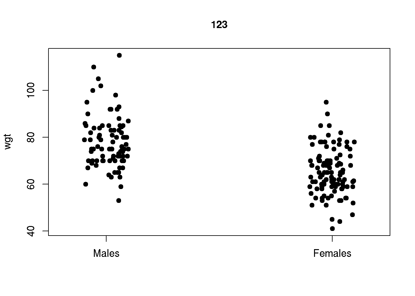
Note that the plot will appear slightly different every time you run the stripchart command as the noise added in the x-direction is random. You may add the same random noise every time you run the command if you set a seed using set.seed() before running the command, e.g:
set.seed(123)
stripchart( wgt ~ gender, data=d, vertical=TRUE, method='jitter', pch=19 )
We have chosen a seed of 123, you may choose whatever number you prefer. You will have to run both commands every time to have the exact same stripchart as R forgets the seed.
7.1.5 QQ-plot
We usually assess whether a variable is normally distributed using Quantile-Quantile plots (you will use these plots in the course):
qqnorm( d$wgt )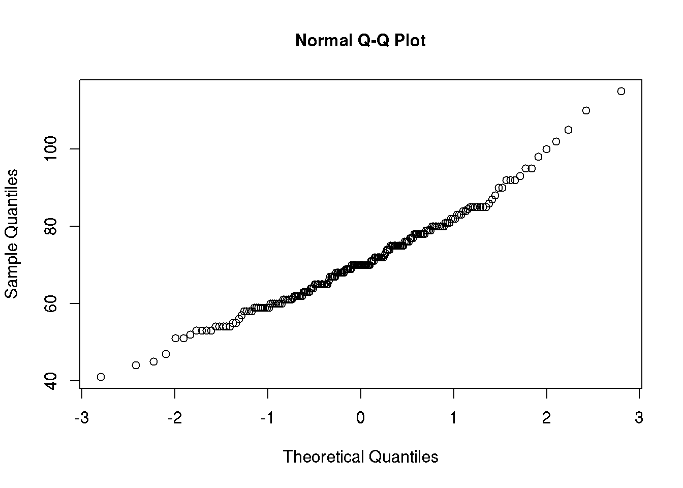
A straight line can be added to ease evaluation of whether the variable is normally distributed:
qqnorm( d$wgt )
qqline( d$wgt )
7.1.6 Combining several plots in one graph
The par()-function is used to set graphical parameters. Several plots can be put in the same graph using par() with argument mfrow=c(nrow,ncol), nrow specifying the number of rows and ncol the number of columns. Specifying par(mfrow=c(2,2)) gives us a graph window with 4 plots in total:
par(mfrow = c(2, 2)) # Define the graph to have 2 rows and 2 columns

# Plot 1
plot( d$ht, d$wgt, pch = 17, col = 'gray' )

# Plot 2
hist( d$wgt, col='lightblue' )

# Plot 3
boxplot( d$wgt ~ d$gender, col=c('pink','salmon') )

# Plot 4
stripchart( wgt ~ gender, data=d, vertical=T, method='jitter',
            col=c('aquamarine','plum'),pch=20)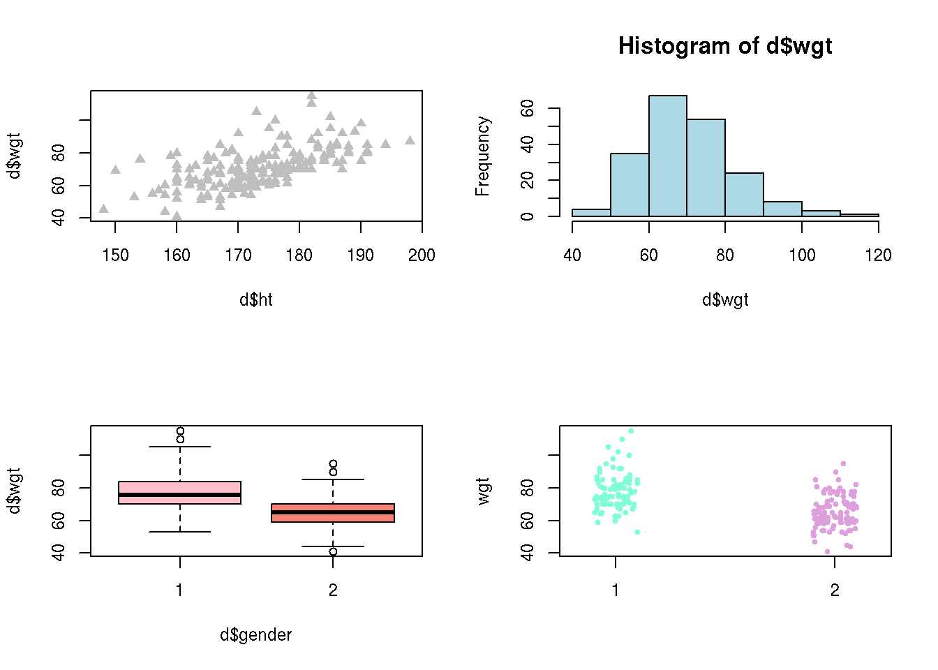
R will continue to produce graphs with 4 plots in each until we change the number of columns and rows. To get back to the default, one row and one column, run par(mfrow = c(1,1)).
For fun with colors use this color palette.
7.2 An example of customizing a graph
In this chapter we will show how to produce the graph below. This is illustrated in a video where we show how to dynamically adjust plots in R. The video serves as an introduction to the training activity in the next chapter (7.3).
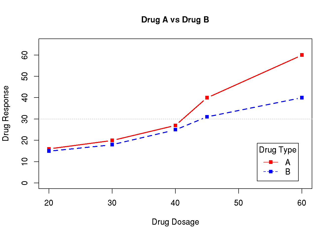
The above graph shows the mean profile for a drug response for each of two drugs (drug A and B). The mean response for each dose is illustrated using a point, and the points for each drug are concatenated with lines. Further a legend describing the color codes is added.
How to produce the graph is explained in this video:
Contents of the video
The data used in the video can be directly generated using the lines:
d <- data.frame( dose  = c(20,30,40,45,60),
                 drugA = c(16,20,27,40,60),
                 drugB = c(15,18,25,31,40) )
The plot is generated plotting the response for drug A as a function of the dose using the plot() function. The labels on the axes are modified, the points are plotted in red using plot symbol with code 15. Further the plot type is set to 'b', adding lines between the points. A title (main) is added, the line width (lwd) is specified to be the double of the default and the limits of the y-axis is set to 0 to 65:
plot( d$dose, d$drugA, xlab='Drug Dosage', ylab='Drug Response',
      col='red', pch=15, type='b',
      main='Drug A vs Drug B', lwd=2, ylim=c(0,65) )
In the next step we add the points for drug B to the plot using the lines() command. The lines command will add a line to the current plot and will not generate a new plot in the plot window. The response is plotted using the same plot symbol (no 15) and the points are joined with lines (type='b'), color is blue, line width is double and the line type is dashed (lty code 2, see Chapter 7.4 for possible line types):
lines( d$dose, d$drugB, col='blue', type='b', lwd=2, lty=2, pch=15 )The reference line is added using the command abline() specifying that we want a horisontal line at y=30. Color is specified to be grey, the width of the line is half the default and the line type is dotted (lty code 3):
abline( h=30, col='grey', lwd=.5, lty=3 )Finally a legend is added at the bottom right corner of the plot using the legend() command. The first argument is the location (choose between 'bottomleft' / 'bottomright' / 'topleft' / 'topright' ) and the second is the text. We will illustrate using the plot symbols (pch=15), the line types (full and dashed, lty=c(1,2)) and the colors (col=c('red','blue')). The legend text, the color and the line type each has two options. These are concatenated using the c() function and it is important that the order of each of these coincides with the values used for plotting (i.e. first option legend text ‘A’ corresponds to first option for the color ('red') etc.). The inset argument defines the inset distance from the margin and if set to a value larger than 0, the legend is moved away from the box surrounding the plot (you may experiment with the values, choose small values). Finally a title is added to the legend using the title argument.
legend( 'bottomright', c('A','B'), pch=15, col=c('red','blue'), lty=c(1,2),
        inset=.05, title='Drug Type' )
7.3 Training activity
Treatment of breast cancer with Tamoxifen
In this training activity we will consider data from a randomized study of the effect of Tamoxifen treatment on bone mineral metabolism in women with breast cancer. The purpose of the training activity is to produce this graph (details given below):
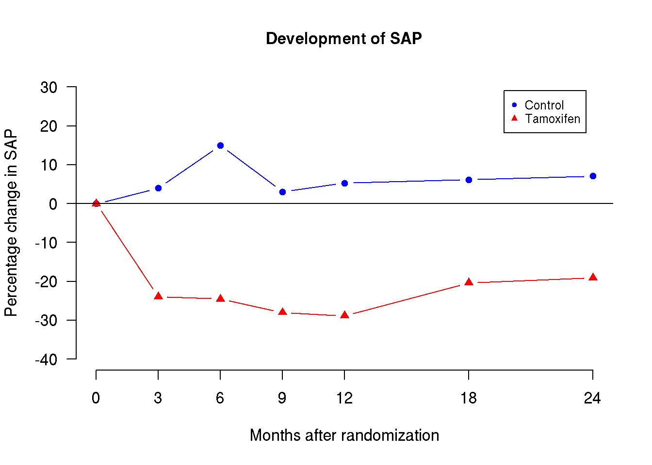
The figure is based on a data set that can be downloaded from here. Either follow the procedure described in Chapter 4.3 or read the data directly from the link using (and at the same time viewing the first 6 lines of the data)
d <- read.csv('http://publicifsv.sund.ku.dk/~sr/intro/datasets/Tamoxifen.csv',
              header=T)
head(d)
Grp c0 c3 c6 c9 c12 c18
1 1 0 -1.408451 11.971831 14.0845070 7.042254 23.2394366
2 1 0 5.000000 0.000000 21.6666667 11.666667 -0.8333333
3 1 0 -8.000000 -4.000000 -6.2857143 21.714286 10.8571429
4 1 0 -13.247863 -25.641026 -15.8119658 23.504274 -25.6410256
5 1 0 13.829787 55.319149 31.9148936 36.170213 4.2553191
6 1 0 -6.435644 2.970297 0.4950495 3.465347 -0.9900990
c24
1 4.225352
2 -3.333333
3 26.285714
4 -19.230769
5 21.276596
6 7.920792Each line in the data set represents one woman. The data set contains the following variables:
| Variable name | Content |
| Grp | Treatment group (1: Control, 2: Tamoxifen) |
| c0 | Baseline measurement of serum alkaline phosphatase |
| c3 | Serum alkaline phosphatase 3 months after randomization |
| c6 | Serum alkaline phosphatase 6 months after randomization |
| c9 | Serum alkaline phosphatase 9 months after randomization |
| c18 | Serum alkaline phosphatase 18 months after randomization |
| c24 | Serum alkaline phosphatase 24 months after randomization |
All measurements of serum alkaline phosphatase are measured as the percentage change in serum alkaline phosphatase (SAP) from baseline (c0). In particular c0=0.
The graph above shows the development of SAP levels in the two treatment groups over time. The dots represent the mean values and the points are joined within each group.
Below you are guided through the steps to produce this graph.
-
For each treatment group, determine the means for all time points and save them in two vectors named m1 and m2. You may use the code:
d1 <- subset(d, Grp==1) d2 <- subset(d, Grp==2) m1 <- c( 0, mean(d1$c3), mean(d1$c6), mean(d1$c9), mean(d1$c12), mean(d1$c18), mean(d1$c24) ) m2 <- c( 0, mean(d2$c3), mean(d2$c6), mean(d2$c9), mean(d2$c12), mean(d2$c18), mean(d2$c24) )m1is thus a vector with 7 elements containing the mean change in SAP at the 7 time points of measurements. -
Create a vector with the time points:
times <- c(0,3,6,9,12,18,24). -
Plot the means for the control group,
m1, as a function oftimesusing the plot argumenttype='b'. -
Add a similar curve for the Tamoxifen group to the plot using
lines()(i.e.m2as a function oftimes). Notice that the new points are below the y-scale of the plot, so you need to revise the initial plot by setting a suitableylimvalue. -
Add the horizontal line at y = 0 using e.g.
abline(). -
We need a nonstandard x-axis as we will only want the months to be printed on the x-axis for the months with observations. Modify your initial
plot()command by adding the argumentaxes=Fto tell R not to make the axes. The x-axis is added by afterwards specifyingAdd the y-axis by simply typingaxis(1, at=c(0,3,6,9,12,18,24) )axis(2). You may also modify the y-axis by adding anat-argument. -
Use
xlabandylabarguments in the initial plot call to give better axis labels. -
Rotate the values on the y-axis values by running the command
par(las=1)before you run your initialplot()command. - For each group use different plot symbols, line types, or colors. Find the options in Chapter 7.4. Choose your favorites.
-
Add a legend,
Rstudio sometimes stretches the legend. You can avoid that by using the optionlegend(), with the plot symbols and group labels. You can use placement'topright'to have the legend placed at the upper right corner.cex=0.5(or some other number < 1 when usinglegend()). - Add the title to the plot.
-
Save the plot as a jpeg or pdf file. There are two ways to do that:
- In the plot window press the Export button. Chose ‘Save as Image’ and choose jpeg as the Image format. To save as a pdf file instead choose ‘Save as PDF’.
-
Use command
jpeg()orpdf()to generate the files. The argument is the name of the file. First specify where you want R to save the file. You can browse to this folder using the menu ‘Session’ -> ‘Set Working Directory’ -> ‘Choose directory’. Afterwards use commandsThepdf('Tamoxifen_plot.pdf') # # ... your plotting commands par( las=1 ) plot( x, y ) # ... dev.off()pdf()command allows you to print to the file, next you give all your plotting commands and finally you close the file usingdev.off()(device off). Note that R will not print the plot in your plot window but will rather direct all your plots to the pdf file until it has been closed. You should now have a pdf file named ‘Tamoxifen_plot.pdf’ in the folder you selected.
You may find an explanatory solution to the activity here.
7.4 Colors, plot symbol codes and line types
7.4.1 Colors
The colors are always controlled in the col argument for the various plotting functions. Colors may be specified using numbers or the name of the color (in citation, e.g. col='red').
The numeric color codes can by any positive integer. There are 8 different numeric color codes, for values larger than 8 the color codes will circulate (modulo 8, i.e. 9 will correspond to 1, 10 to 2, etc). The colors are
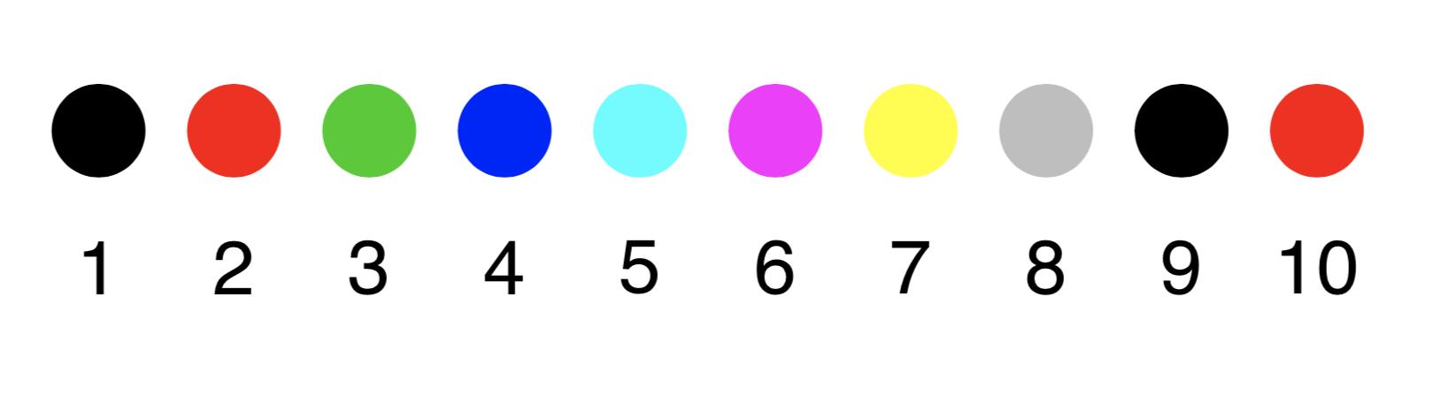
Figure 7.1: The numeric color palette
Many other colors are available in R when specifying the color by name instead of using an integer value. A complete list of the colors and their names can be found using this color palette.For example the argument col='salmon' will give you a delicate salmon-like color.
7.4.2 Plot symbols
The plot symbol is controlled using the pch argument. We may use integers to control the plot symbols, e.g. pch=6 for triangles:
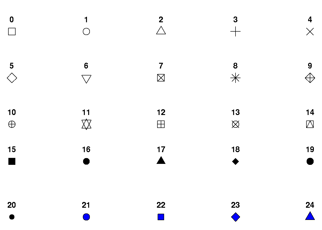
We may also plot using letters, e.g. pch='a'.
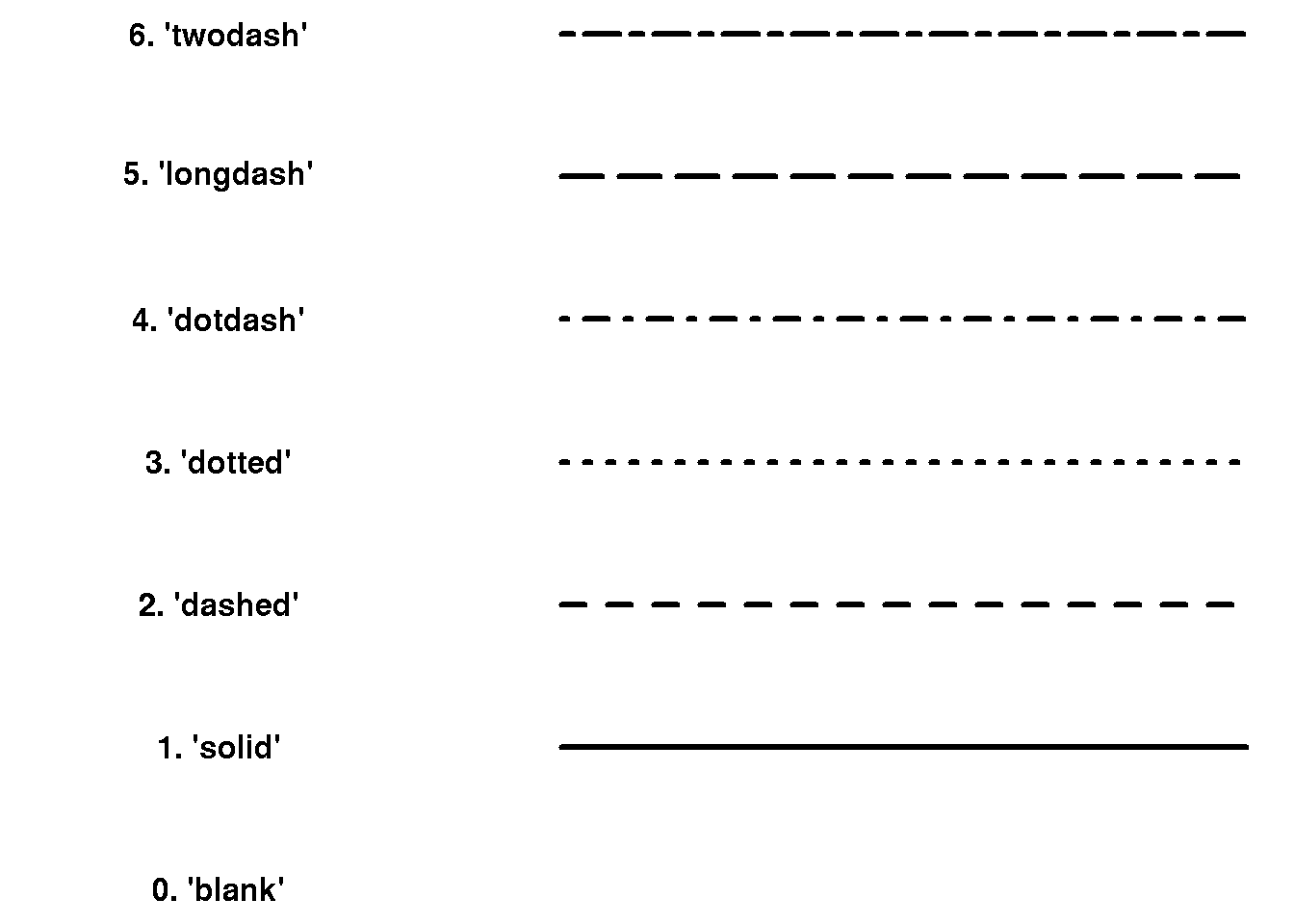
7.4.3 Line types
We can control the type of lines using the line type lty argument, e.g. lty=3 for dotted lines:
7.5 Examples of more advanced plots
7.5.1 Histogram with density
We may add the density curve to a histogram if we plot the histogram using probabilities instead of frequencies. This is specified using extra argument prob = TRUE to the hist() funtion (Chapter 7.1.2) which ensures that the area of the histogram sums to 1 as required for a density. The density curve corresponding the the observed data distribution (a so-called kernel density) may now be added using lines() in combination with density():
hist( d$wgt, main="SundBy", col='lightgray', xlab="Weight", prob = TRUE)
lines( density( d$wgt, na.rm=T ) )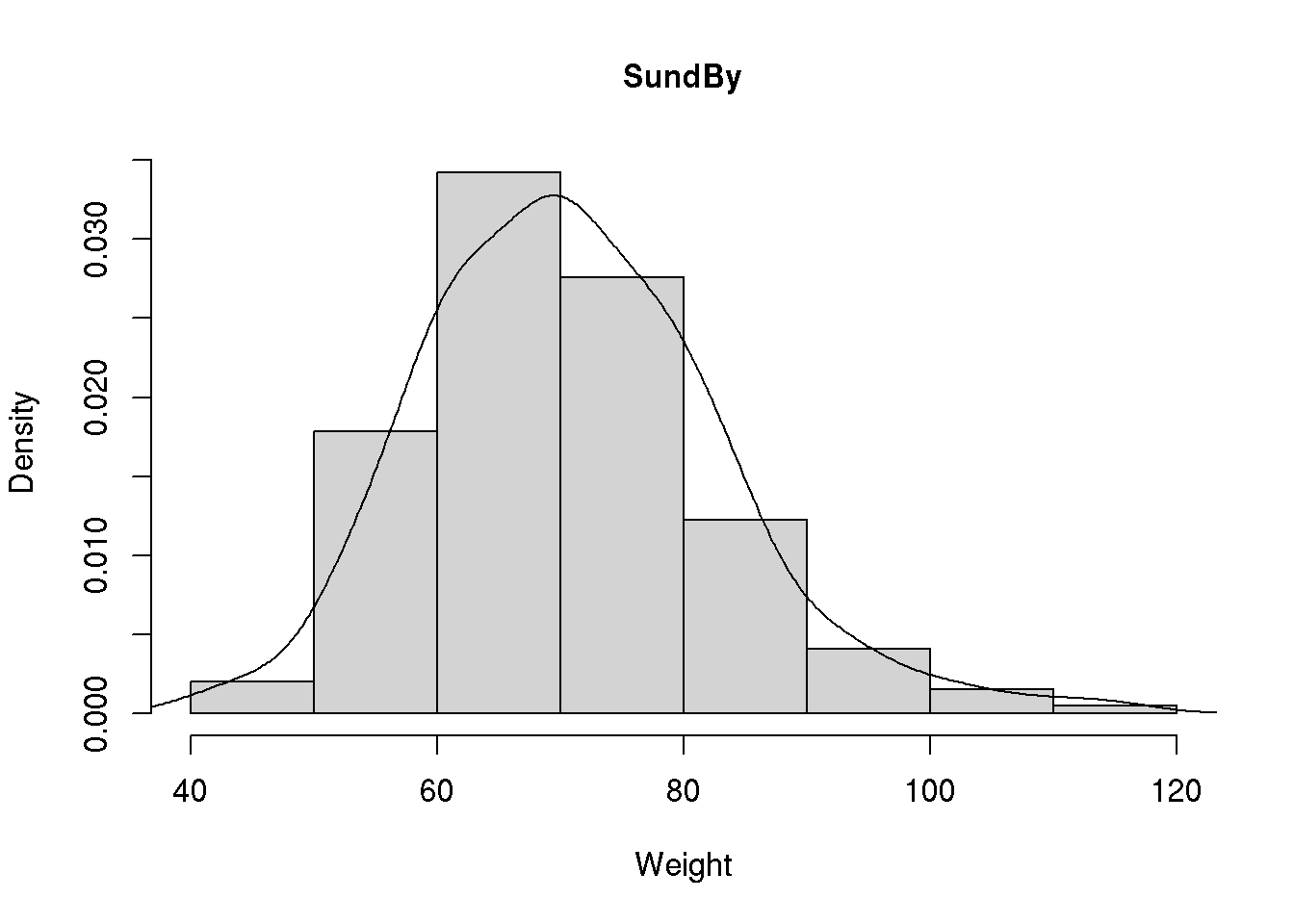
Adding the density of the normal distribution to our histogram requires a bit more effort. First we need to find the mean and the standard deviation of our weight variable, mean( d$wgt, na.rm=T )=70.94 and sd( d$wgt, na.rm=T )=12.18. Next we have to determine the value of the normal density curve for selected values of our weight variable. We may here use the sequence we defined above. For ease of notation we will save the sequence in a vector named x and next determine the value of the normal density function at these values (using the function dnorm()):
x <- seq( from=40, to=115, by=5)
y <- dnorm( x, mean=70.94, sd=12.18 )
Note that we saved the values in a vector named y. We may now add the line corresponding to these x- and y-values to our histogram:
hist( d$wgt, main="SundBy", col='cyan', xlab="Weight", prob = TRUE)
lines( x, y )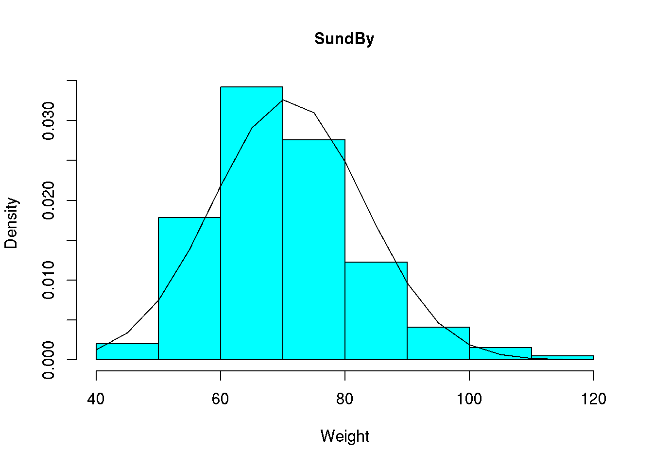
We note that the curve is a bit too bumpy but we may make it more smooth by determining the value of the normal density for all values between 40 and 115. This may be done using x <- seq( from=40, to=115, by=1) or similarly x <- 40:115:
x <- 40:115
y <- dnorm( x, mean=70.94, sd=12.18 )
hist( d$wgt, main="SundBy", col='cyan', xlab="Weight", prob = TRUE)
lines( x, y )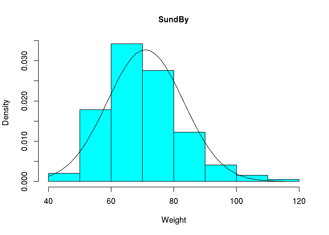
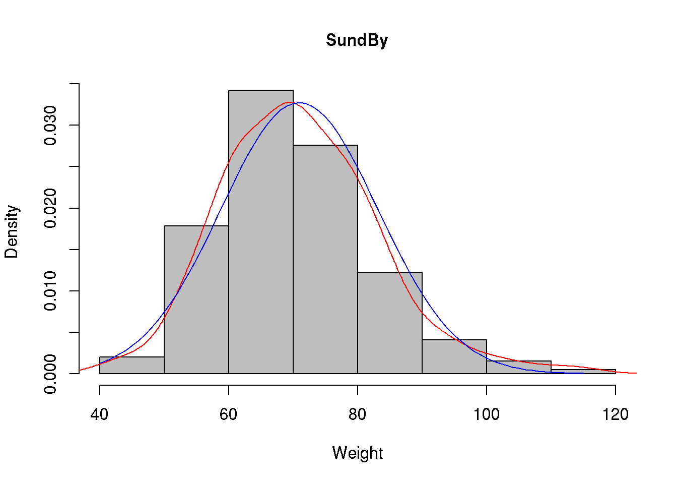
We may even add both density curves to our histogram:
hist( d$wgt, main="SundBy", col='gray', xlab="Weight", prob = TRUE)
lines( density( d$wgt, na.rm=T ), col='red')
lines( x, y, col='blue' )